Crime in Montreal: Lower in Winter, and lower at night

Since I’m currently visiting the Montreal area, I figured why not become more familiar with the city and its crime. But why crime? Surely there are nicer things to learn about Montreal than its crime rates? The reason why I’ve picked crime is that police data on crimes is usually publicly accessible, and contains geographic and date information. It’s an easy source of data that you can explore with.

Background on Data

I first discovered this visualization when looking for Montreal crime data. Besides the fact it is only in French, it only allows you to filter by type of category and date. Once I found this visualization though, it was only a hop and a skip to finding the raw data behind it: http://donnees.ville.montreal.qc.ca/dataset/actes-criminels

Also incredibly helpful, is the fact that this page provides some background on methodology and a data dictionary. You can read the full details on the website but essentially, for privacy reasons, they made the location of the incident at a street intersection and exact time grouped into periods of day, evening, and night.

I noticed right away that some information provided in the raw data isn’t captured by the current visualization. Such as time of day and the neighborhood station number that covers the area where the criminal act occurred. Perhaps we can explore this information more.

Building the Visualizations

I decided to use Tableau to build my visualizations. 1) Because it is pretty 2) Can easily publish and share 3) Time investment is lower compare to other options (I didn’t want to spend more than a couple hours on it).

One thing I had hope to do in the Tableau is to have the ability to switch between English and French in the visualization depending on the user. Unfortunately, while you can change the language of the Tableau software, you can’t really have labels/titles shift based on a language selection parameter (https://community.tableau.com/ideas/1649). Apparently the closest you can come to it is hacking XML but it still results in separate workbooks for each language (https://tableauandbehold.com/2015/08/20/full-localization-of-tableau-workbooks/). Obviously the level of workaround is quite high for this particular issue and doesn’t even result in a ideal finished product. Cue the hate part of the hate/love relationship with Tableau

Despite this initial disappointment, I was at least able to easily change the Alias/Titles to the English translation (apologies in advance for any mistranslations, I was relying on google translate). After some dragging/dropping, and playing around with colors, I was able to produce this.

Conclusion

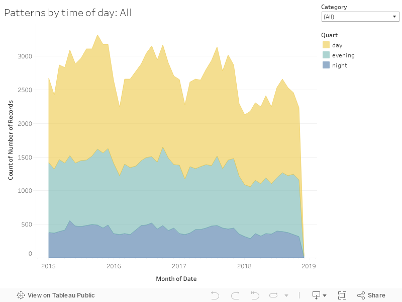
Based on my visualizations, it looks like overall, most crime incidents in Montreal happen during the day (i.e. not evening or night).

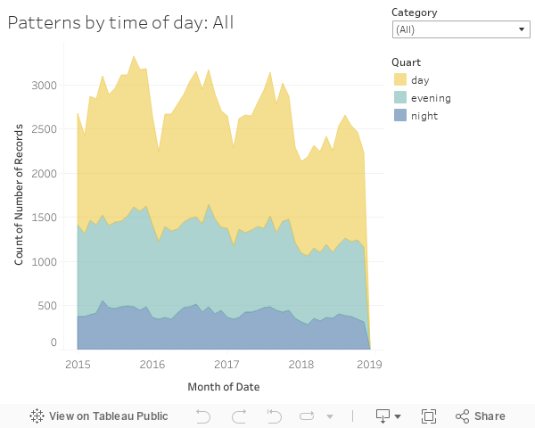
This in itself isn’t terribly surprising. Many people commute into Montreal for work so they aren’t staying there during evening/night hours. One might suppose that during the times there are less people in Montreal, there tends to be less incidents. When we look at incidents by category, we begin to see a different story emerge. For example, breaking and entering into a residence, tends to have an equal number of incidents between day hours and evening hours.

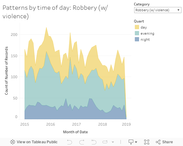
Also defying the overall trend, it seems that acts of robbery occur the most often in the evening.

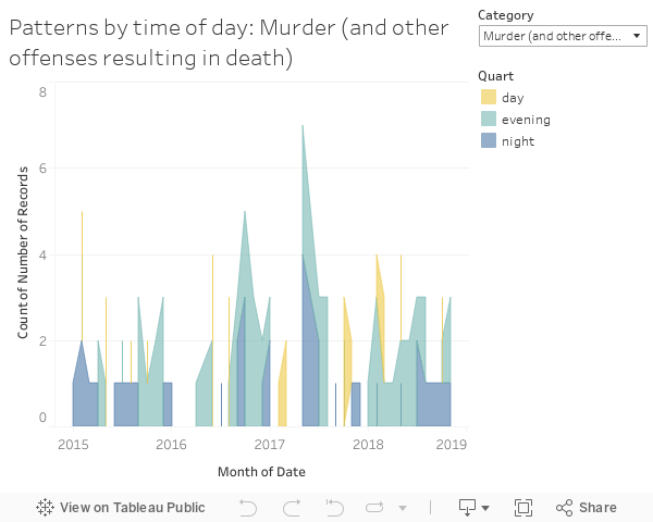
And for incidents like murder, we don’t see a particular pattern at all.

We see another story when we look at criminal acts reported by time (i.e. month). It seems that in the winter months, in general there are less criminal acts registered.

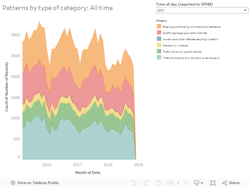
Visually, it looks like January and February are low points in incidents across all categories although the drop is more severe in some categories than in others. If I had to assume why, I would guess this is largely due to how cold it is in Montreal in the winter. People are less likely to hang around outdoors and there is probably also a drop in tourism to the island.

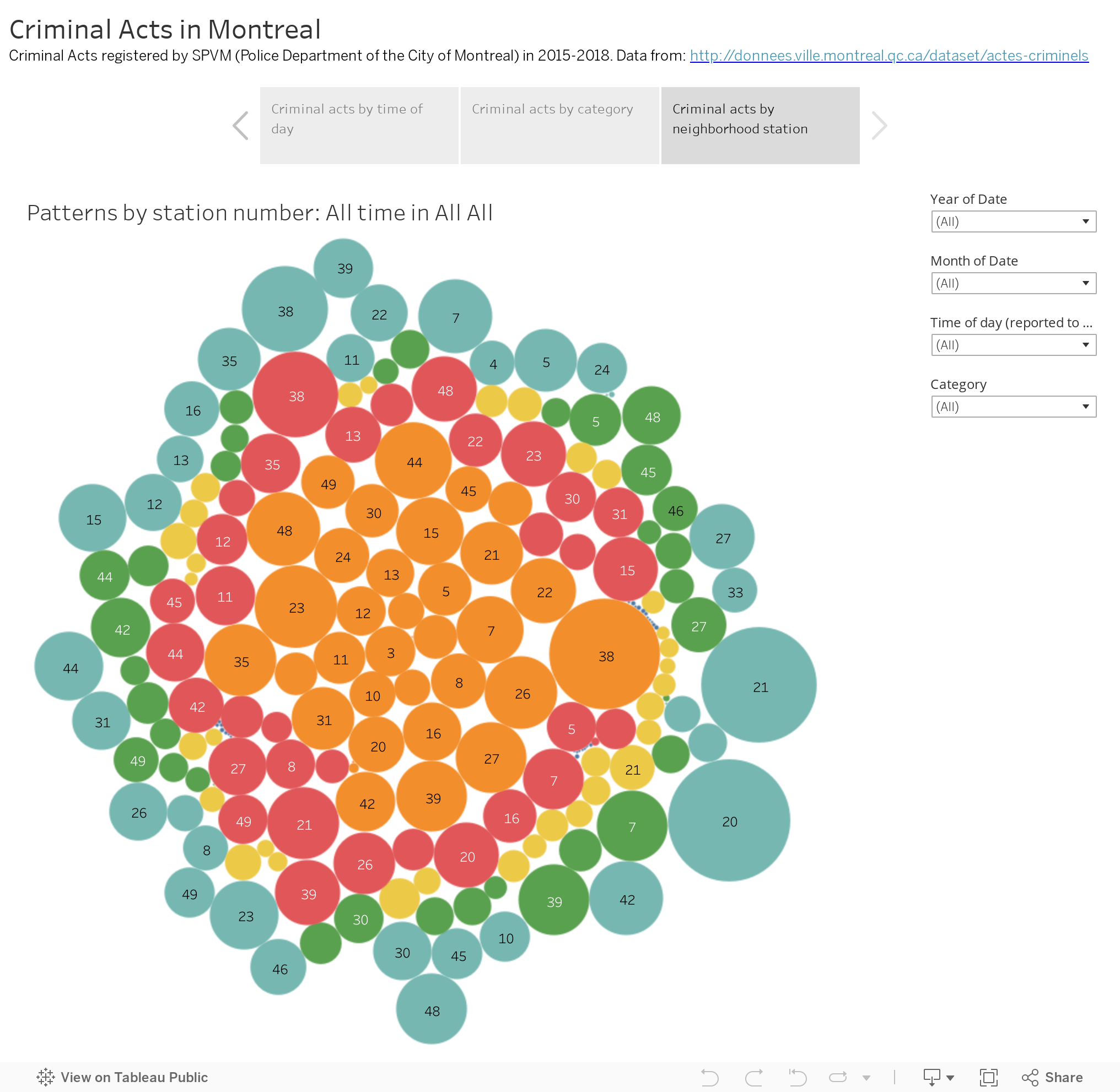
In regards to my last visualization, I won’t go into too much detail other than as you filter between different categories, you will notice that certain station numbers deal with certain incidents more often than others.

Future Directions

Hopefully this was a good crash course on exploring the SPVM data on registered criminal acts, but there is always room for improvement. If I wanted to invest some more time, I could probably put in some different views by station number and add in the geography for those neighborhoods by finding a secondary source. I could also add in data on temperature highs by date from another source.

Tableau: Pros and Cons

Over the last few years, we have seen a rise of Tableau being used in industry. For those not familiar with Tableau, it is a software product that you use for data visualizations. I highly recommend you check out the public gallery so you can get an idea of the range of visualizations that can be created: https://public.tableau.com/en-us/s/gallery

As someone who has used Tableau extensively over the last couple of years, I like to think I have a pretty good grasp on Tableau.

Pros

Let’s be honest here. The best thing about Tableau is how visually appealing the visualizations you can create are. It really is the most attractive quality it has. Plus, it is so easy to make it interactive and to quickly change features on it. That is not something that I would say about visualizations I have to code by hand (R Shiny, etc.)

Cons

It is a proprietary software. You are learning how to use it, not how to code something up. And what makes it so easy to use, can become a curse if you are trying to do something very specific and custom. Do you want a diagonal line in your plot? Well, be prepared to go through a bunch of hoops and hacks to do so in a software that is suppose to be intuitive and easy to use. But if I’m going to be honest, one of the things that bugs me the most is how confusing all the software and pricing options are. And how often they change: https://www.tableau.com/pricing

Pricing

As of right now, Tableau Creator is an individual license for Tableau Desktop and Tableau Prep with the ability to create for Tableau Server/Online. Tableau Desktop is actually the software you use to create visualizations. Tableau Prep is what you can use to prep the data for visualization work. And you can use Tableau Server or Tableau Online to share your visualizations with others. It should be noted that these options are separate from Tableau Public. Tableau Public is where visualizations can be shared publicly with anyone (no privacy options). You could use Tableau Public and not download Tableau Desktop, but the functionality in Tableau Public is fairly limited.

Before we move on in the pricing conversation, I feel like I should talk about Tableau Prep. This is a new software that has come out in the last couple of years in response to complaints on how hard it is to manipulate data and its shape within Tableau Desktop. When I was told they were working on something to make it easier, I assumed it was going to be within Tableau Desktop, but instead we got a separate piece of software. In all honesty, I don’t really use Tableau Prep. As someone from the data analysis field, I have other tools (i.e. R and python) that are free to use and often already built into my data pipelines. Why use a proprietary software when I can just as easily do data manipulation on my own? Because of this, I wished they offered license option without Tableau Prep.

Then of course, you have the group options which can allow explorers/viewers. You can set up something on-premises/cloud (Tableau Server) or have one hosted by Tableau (Tableau Online). However, you will need at least one ‘Tableau Creator’ and the fine print specifies that for the explorers/viewers categories there are required minimums. Now what are the distinctions between a Tableau viewer and explorer? A Tableau viewer is someone who can view a visualization within a group server and interact with it but they can’t download the data or edit existing visualizations, or manage user permissions. A Tableau explorer is someone who has all the ability of a Tableau viewer, and can download data, edit existing visualizations, and manage user permissions. In the workplaces I’ve been in though, not many people fall under the Tableau explorer category. The people who are going to edit an existing visualization are likely the same people who are going to create and publish new workbooks, and would need a creator license anyway.

Note: If you work in academia (student/instructor/researcher) and are using Tableau for non-commercial purposes, you can get ahold of Tableau Desktop (i.e. Creator license) for free.

Student: https://www.tableau.com/academic/students

Instructor: https://www.tableau.com/academic/teaching

It is a little unclear which method Researchers should use to get ahold of a Tableau Desktop. There used to be a separate method but it looks like at the moment, going the Instructor route is the most appropriate.

Conclusion

As always with Tableau, it is a bit of a hate/love relationship. If you want something custom (i.e. deviates from the options readily available), be prepared to spend some time as well as extensive googling. However, the beauty of Tableau can’t be denied and there is something very satisfying about how quickly one can generate a scatter plot and filter it out by a variety of metrics. If you have some coding experience already, I recommend learning how to use Tableau as it is widely in demand but not often taught on.